



Overview
Strawng is a sustainable alternative to single-use plastic straws, made from rice and designed around a simple idea: everyday choices can create meaningful environmental impact.
The existing brand already communicated the problem of plastic pollution, but much of its visual language centered on what people should avoid—the damage caused by plastic, environmental waste, and the consequences for marine life.
The redesign shifted the perspective.
Rather than building the brand around the problem, the goal was to build it around the alternative: what Strawng was made from, what choosing it could protect, and how sustainable behavior could feel more positive, approachable, and easy to participate in.
Challenge
Sustainability brands often communicate through urgency.
Pollution, waste, damaged ecosystems, and environmental consequences are powerful realities, but they can also make the audience feel as though they are being warned, corrected, or asked to feel guilty.
Strawng already had a strong environmental purpose. The challenge was not changing what the brand believed in. It was changing how that belief was communicated.
The identity needed to move beyond familiar sustainability aesthetics and develop a visual language that felt distinctly connected to Strawng itself.
It also needed enough flexibility to speak to different generations—mature audiences who make purchasing decisions today, and younger audiences who may carry environmentally responsible habits with them into adulthood.

The Insight
The previous identity focused heavily on the consequences of plastic.
The opportunity was to shift attention toward the positive action available to the consumer.
Instead of repeatedly showing waste, pollution, and environmental damage, the redesign focused on Strawng's defining product characteristic: the straws are biodegradable and made from rice. The rice form became a recurring visual device throughout the identity, replacing more generic environmental graphics with something directly connected to the product. STRAWNG - Styleguide
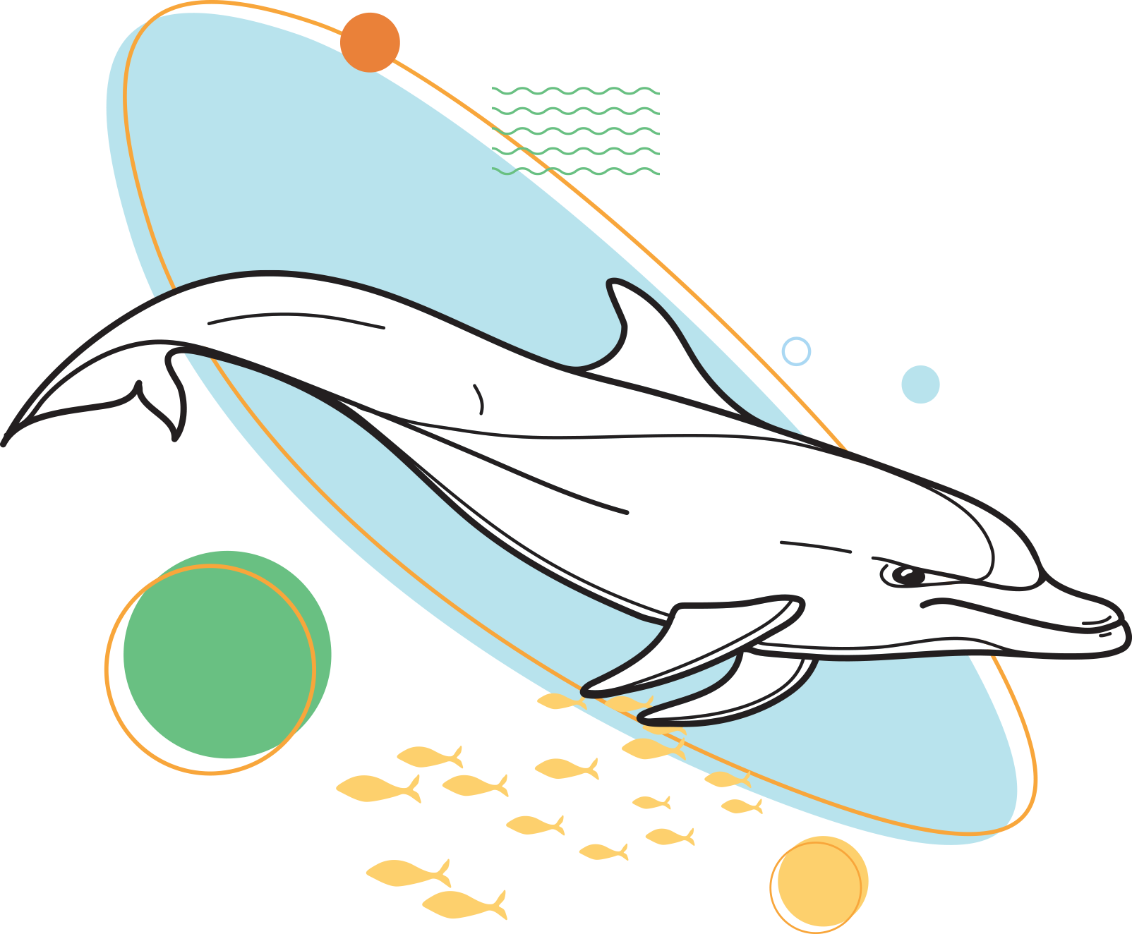
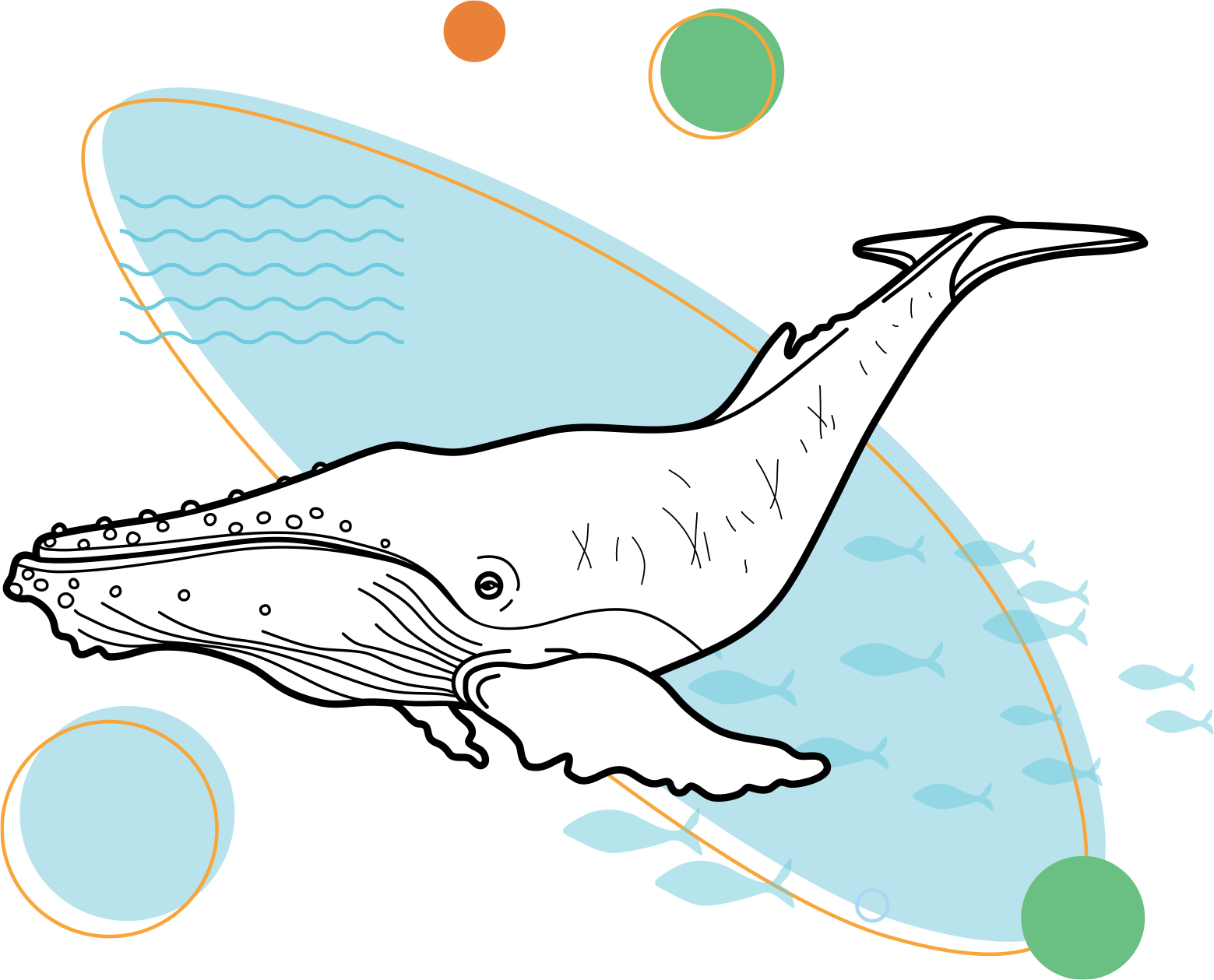
Marine animals remained part of the story, but their role changed.
Rather than existing primarily as symbols of environmental harm, they became representations of what choosing an alternative could help protect.
The communication moved from:
Look at what plastic is doing.
to:
Look at what choosing differently can protect.

The Strategy
The strategy was built around positivity, accessibility, and participation.
Strawng still needed to communicate a serious environmental issue, but it did not need to look or sound severe to do it.
The visual language therefore had to balance several qualities at once:
Playful without becoming childish.
Environmental without becoming preachy.
Educational without feeling academic.
Optimistic without minimizing the problem.
This balance also created space for the brand to connect with younger audiences.
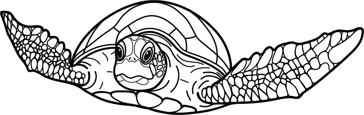
The intention was never to turn Strawng into a children's brand. Instead, the identity was designed so younger people would not feel excluded from the conversation. The illustration system, educational applications, and concepts such as coloring activities gave the brand a point of entry for both adults and children.
That mattered because small environmental habits can become more meaningful when they are introduced as part of everyday life rather than treated as exceptional behavior later on.





Impact
The system was designed to extend beyond a single campaign or piece of packaging.
The rice-inspired graphic language, illustrations, typography and color palette could move between brand communications, product messaging, digital content and educational materials while remaining recognizably Strawng.
The illustration system also opened opportunities beyond conventional marketing.
Applications such as an adult-and-children's coloring book turned the identity into something people could actively interact with, creating another way to introduce environmental ideas through participation rather than instruction.
This helped transform Strawng from a brand that simply communicated sustainability into one capable of creating experiences around it.
Iteration Notes
The project reinforced an idea that became increasingly important throughout the redesign:
Sustainability does not always need to communicate through fear.
Environmental problems are serious, but communicating their seriousness does not require every interaction with the brand to feel heavy.
For Strawng, the stronger direction was to show people an alternative—to make the better choice visible, understandable and inviting.
The result was an identity built less around what people were being asked to give up, and more around what a small change could contribute to protecting.

Thanks for stopping by. Let me return the favor.
Get a free, no-strings brand audit — crafted personally by me. Not a newsletter. Not a download. Just real feedback on your brand. No fluff — just clear, honest insight. This is a one-time audit delivered directly by me — no templates, no spam, no obligation.