

Defining a Cultural Performance Brand Through Strategic Exploration
Overview
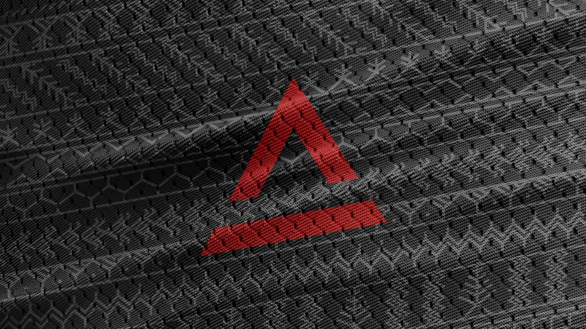
Ahon is a Filipino outdoor apparel brand built at the intersection of heritage and performance—designed for individuals who move through the outdoors while carrying a strong sense of identity.
What began as a request for a logo redesign evolved into a broader effort to define a clear and scalable brand direction.
Challenge
The initial brief was straightforward: redesign the logo.
But early in the process, it became clear that the logo wasn’t the core issue.
The brand lacked clarity and consistency—a concern already identified by the founders themselves during alignment, where “professional-looking branding” and “consistency” were top priorities .
Without a defined direction, any visual update would only be surface-level.

The Insight
The discovery session revealed a deeper tension at the heart of the brand.
Ahon’s audience wasn’t looking for purely technical outdoor gear.
They wanted something more:
Equipment that performs
A brand that represents Filipino identity
This duality—function and heritage—became the foundation.
The opportunity wasn’t to choose between the two, but to merge them into a single, coherent identity, a “marriage of aesthetics and technical solutions” already embedded in the brand’s own positioning.
The Strategy
The strategy was to define a direction before designing anything final.
Instead of jumping straight into execution, I developed multiple visual territories through stylescapes—each representing a different way to interpret the brand’s core idea.
This allowed the team to:
Explore the extremes
challenge assumptions
and align on a direction with intention
Stylescape 1
Trendsettingly Unique
A bold, high-energy direction that leaned heavily into visibility and cultural expression.
Bright orange, aggressive typography, and expressive compositions positioned Ahon as loud, unapologetic, and attention-grabbing
This direction proved the brand could stand out—but risked overpowering its technical credibility.
Stylescape 2
Culturally Eco Conscious
A more grounded approach focused on heritage, nature, and sustainability.
Muted tones, organic textures, and environmental cues emphasized authenticity and cultural depth .
This direction reinforced meaning—but leaned too far into lifestyle and away from performance.
Stylescape 3
Technically Subtle
A restrained, modern system that balanced technical precision with quiet cultural cues.
Minimal compositions, structured layouts, and controlled use of color positioned Ahon as a serious performance brand—without losing its identity
Design Outcome
The final identity system was built on the “Technically Subtle” direction.
It emphasized:
clean, structured layouts for clarity and scalability
minimal but intentional cultural references
a controlled color system, with accents derived from earlier explorations
The result was a visual language that could function across apparel, digital platforms, and physical touchpoints - while maintaining a consistent balance between performance and identity.
Impact
The redefined brand system gave Ahon:
a more professional and cohesive presence
a clearer positioning in the outdoor space
a stronger alignment between what they make and what they represent
Beyond the visual system, the project gave the brand a clearer internal compass: a way to evaluate future design decisions through the balance of performance, identity, and cultural relevance.
Iteration Notes
This project reinforced a key principle:
Good design is not about arriving at the first answer—it’s about exploring the right questions first.
By intentionally pushing different directions, we didn’t just find what worked—we understood why it worked.
That clarity ultimately made the final decision stronger.